
How to Turn Website Visitors into Paying Clients
Web Design Tips · Business Growth
Most websites look fine. Fine does not get clients—here are ten specific ways to close the gap between looking good and getting hired.
Your website is not a digital business card. It is a sales tool — and for most service-based businesses, it is their most underperforming one.
If you offer custom, done-for-you services—design, consulting, coaching, trades, professional services—your site has to do more than look polished. It has to earn trust, communicate your value, and move the right people toward reaching out. Quietly, every element signals something: your words, your photos, how easy it is to find what someone needs. Visitors read all of it before they decide whether you are worth their investment.
The problem is that most websites look fine these days. Fine is not enough. The difference between a site that gets clicks and a site that gets clients comes down to how clearly it communicates your value, your process, and the results you actually deliver. Here are ten specific ways to close that gap.
Messaging
1. Lead with Language That Actually Means Something
You have roughly three seconds when someone lands on your homepage. That window closes fast if they read something like:
✕ Says Nothing
"Premium solutions for modern businesses."
✓ Says Something
"We build custom Squarespace websites for service-based businesses that want more of the right clients reaching out."
The first sounds professional. It says nothing. The second does real work: in one sentence, a visitor knows who you serve, what you do, and why it matters to them.
Clear language reads as confidence—and it shows you understand the people you work with. No buzzwords required. Talk the way you would to someone sitting across from you.
If your headline has to stay broad for any reason, let the line underneath it do the specific work. A vague headline followed by a vague sub-headline gives a visitor nothing to hold onto. A vague headline followed by "We work with Canadian accounting firms that have outgrown their first website" still lands.
Navigation
2. Build a Path, Not a Maze
Think about how you explain your services on a call. You do not start in the middle. You walk people through it.

Your website should do the same. A simple flow beats a cluttered page every time:
First: who you are and who you help
Then: how it works when someone hires you
Finally: how to take the next step
On the page, that might look like a short "why people hire us" section, a three-step breakdown of your process, and a clear button—"Book a call" or "Start your project." When your site feels like a calm, guided experience, visitors do not have to work hard. They just keep moving forward.
Positioning
3. Sell the Outcome, Not the Deliverable
Most service pages read like a task list:
Strategy sessions
Brand audits
Website builds
That information is useful to you. It may mean very little to your client.
They are not paying for "sessions." They are paying for what those sessions produce—more leads, more time back, less stress, a brand that finally feels like them.

| The Service | What Most Sites Say | What the Client Actually Wants |
|---|---|---|
| Branding | "We offer brand development packages." | "We help you show up online with a brand that attracts the clients you actually want." |
| Accounting | "Comprehensive tax planning services." | "We help you keep more of your hard-earned money and stop guessing at tax season." |
If you can help someone picture what life looks like after working with you, booking that call becomes a much easier decision.
Proof
4. Use Specific Client Stories, Not Generic Praise
If you are asking someone to invest in a custom service, they are going to look for proof. Generic testimonials do not provide it.
✕ Proves Nothing
"They were great to work with!"
✓ Proves Something
"Within three months of launching the new site, we were getting more qualified leads and closed our biggest project to date."
Even a short case study follows a simple structure:
What was not working before
What you did together
What changed
Specific stories are your most persuasive content. They say, without saying it directly: We have done this before, and it worked. That is exactly the reassurance a cautious buyer needs.
Where you put them matters as much as what they say. A testimonials page on its own is the page nobody visits. Put the proof where the doubt is: the story about a fast, calm process belongs beside your process section, and the one about results belongs beside your pricing or your booking button—right at the moment someone is deciding.
Design
5. Let Your Design Reflect How You Actually Work
Design sends a message before your words do. A crowded, outdated, or confusing site quietly signals: working with us might feel like this too.
You do not need to chase trends or go ultra-minimal. You do need your site to look intentional. A few choices that go a long way:
Give your content room to breathe—cluttered pages feel stressful
Use a consistent, simple colour palette that matches your brand
Use real photos of your team, your work, or your space whenever you can
Choose fonts that are readable on both desktop and mobile
If you are calm, organized, and detail-oriented in how you work, your site should feel like that. If your energy is creative and expressive, let the design reflect it—without tipping into visual chaos. When someone lands on your site, they should think: this feels like someone who cares about doing things right.

Conversion
6. Make the Next Step Feel Safe
A lot of people hesitate right before they fill out a form or book a call. They are wondering: What am I committing to? Is this going to turn into a high-pressure pitch?
The words around your call-to-action matter more than most people realize. Instead of "Submit" or a vague "Contact Us," try something that names the actual next step.
Swap Your Button Text
"Book a quick intro call." · "Tell us about your project." · "Let's see if we're a good fit."
Then add a short line nearby: "No pressure, no hard sell—just a conversation about what you're looking for."
You are still professional. You are just meeting people where they are: a little cautious, genuinely interested, and hoping the interaction will not be awkward.
The same logic applies to the moment right after someone hits send. Silence is where hesitation creeps back in. Tell them what happens next, in plain terms—who will reply, roughly how soon, and what the first conversation actually covers. A single line under the form does it: "We'll get back to you within one business day. The first call is thirty minutes, and it's mostly us asking about your business." That sentence costs you nothing and removes the last reason to close the tab.
About Page
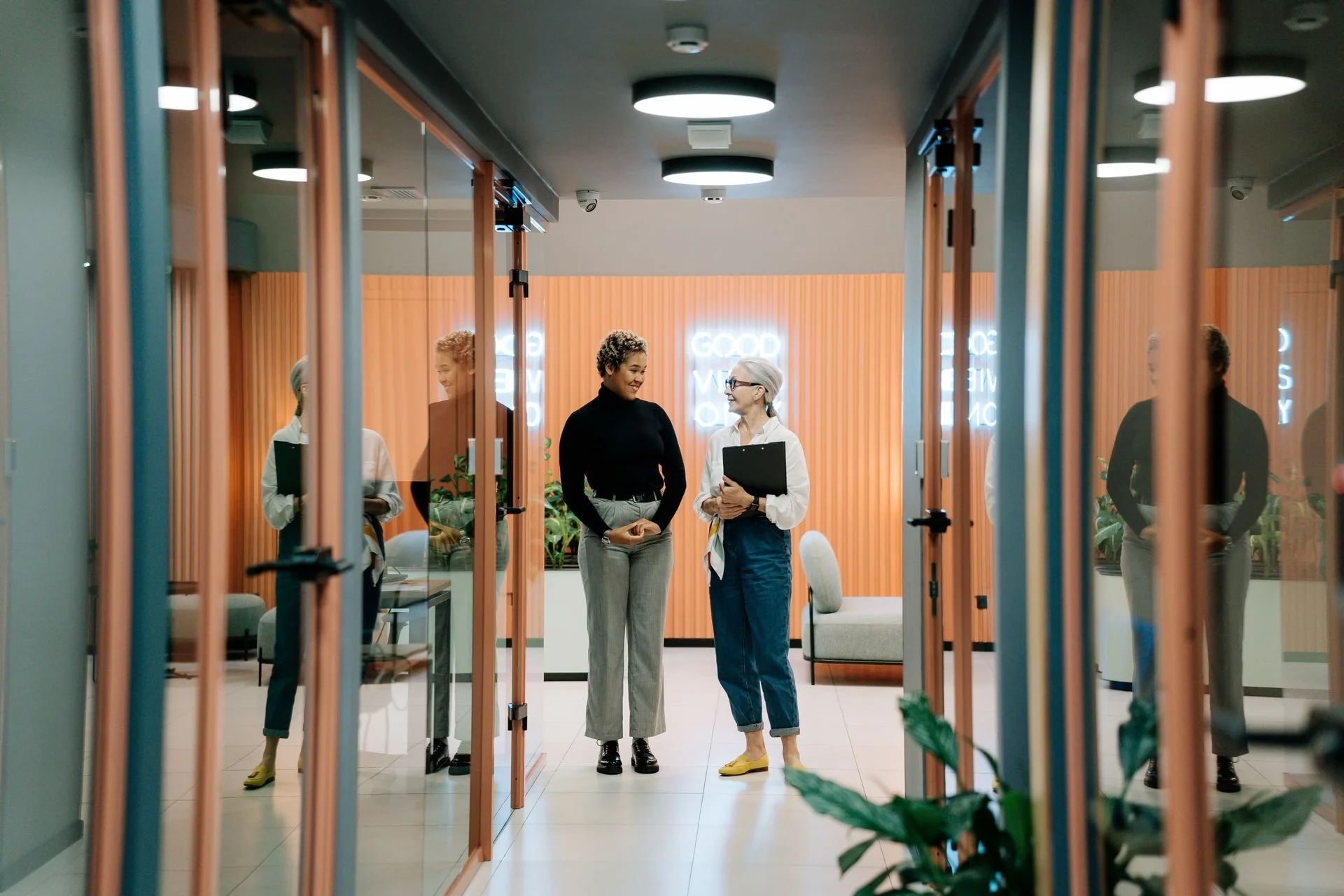
7. Write an About Page That Sounds Like a Person
Your About page is consistently one of the most visited pages on any service-based website. People want to know who they are dealing with before they hand over their money and their project.
A stiff bio or a wall of "we" language does not do that job. A short story that connects the dots does. Cover three things:
Why you started doing this work
What you believe good service should feel like
Who you genuinely love working with
✓ Connects the Dots
"After years of watching great businesses held back by confusing, outdated websites, we decided to build sites that feel as professional as our clients actually are — and that bring in work."
You can still mention your experience and credentials. Just keep it grounded. The goal is "I trust this person"—not "Those are a lot of impressive words."
End your About page with a low-key next step: "If this sounds like the kind of partnership you're looking for, we'd love to hear about your project."
Nurture
8. Give People a Reason to Stay in Touch
Not everyone who lands on your site is ready to hire you today. That does not make them a bad fit — it makes them someone still making up their mind.
Support that process with something low-commitment but genuinely useful:
A short guide ("What to have ready before you hire a web designer")
A checklist ("How to know if your website is ready for a rebrand")
A newsletter with project stories, tips, and behind-the-scenes insight
The key: make it actually useful. If someone hands over their email, they should feel like they are getting something that moves them forward.
For custom, trust-based services, every helpful touchpoint before money changes hands is a trust deposit. Those deposits add up.
Right-Fit Traffic
9. Attract the Right Visitors, Not Just More of Them
You do not need more random traffic. You need more right-fit clients — people who value good work, care about the details, and are ready to invest in professional help.
Start by tightening your language to speak directly to them:
✓ Names the Reader
"For busy service-based businesses ready to hand their website off to an expert." / "For homeowners who want their renovation done right the first time."

Then create content that answers the questions serious buyers are already asking:
"What to look for in a [your service] provider."
"How we helped [client type] go from A to B."
"How to know if you're ready for a custom website."
Share that content where your people already are—LinkedIn, Google Business Profile, Instagram, professional associations, local networks.
Quality of audience consistently outperforms volume.
Iteration
10. Treat Your Website as a Living Thing
Your website does not need to be perfect to start working for you. It does need to be something you revisit and improve—not something carved in stone.
Keep the review simple. Every so often, look at:
Which pages get the most visits.
Which buttons get clicked.
Which pages people leave quickly.
Then make small, targeted improvements:
Rewrite a headline to make it clearer.
Move a strong testimonial higher on the page.
Add a sentence explaining what happens after someone submits your form.
Change one thing at a time. If you rewrite the headline, move the testimonials, and swap the button text in the same afternoon, you will never know which one did the work—and you will not know what to repeat on the next page.
The Best Data You Are Not Collecting
Ask new clients what on the website helped them decide to reach out. Those answers tell you exactly what to amplify, what to create more of, and what is not landing.
Your services have evolved over time. Your website should too.
Putting It Together
The Real Question Your Website Has to Answer
When someone lands on your site, they are quietly trying to figure out three things:
Can you actually help me?
Do you understand what I am dealing with?
Can I trust you with my time, my money, and this project?
Every element we have covered—your headline, your navigation, your client stories, your design, your calls-to-action—is just a different way of answering yes.
Where to start
You do not have to rebuild everything at once. Ten changes is a project. One change is an afternoon. Work in the order a visitor actually meets your site—what they read first, then what they need to believe, then what you are asking them to do:
Rewrite your homepage headline so a stranger knows who you serve and what you do
Replace your strongest generic testimonial with one that names a specific result
Change your button text from "Submit" to the actual next step
Add one line under your form telling people what happens after they send it

Each of those is a single afternoon. None of them requires a rebuild. And each one closes a gap that was quietly costing you the inquiry.
When your website finally feels like working with you—clear, human, detail-driven, and focused on real results—that is when visitors stop lurking and start reaching out.
— ◆ —
Work With Personal Web Pros
Not Sure Where Your Site Is Falling Short?
Start with a free website audit—no strings attached. We will tell you which of these gaps are costing you inquiries, and which ones are worth fixing first.
Get Your Free Audit →Personal Web Pros builds Squarespace websites and brand systems for consultants, coaches, and expert service providers. Your expertise is world-class — your website should be too.