
7 Ways to Modernize Your Website Without a Redesign
Web Design Tips · Business Growth
Quick wins that sharpen your current site's clarity, conversion, and relevance—no overhaul required.
Your website is often the first real impression a potential client gets of your business. Not your social media. Not a referral. Your site. And if it hasn't been touched in a few years, that first impression may be quietly working against you.
The good news: modernizing your online presence doesn't require a full redesign or a significant budget. Most of what makes a website feel dated comes down to a handful of fixable things—copy that's too vague, visuals that feel off, navigation that makes people work too hard. Address those, and the whole site lifts.
This post walks through seven concrete updates you can make at your own pace. No overhaul required. Just focused, incremental improvements that add up.

Copy
1. Sharpen Your Words Before You Touch Anything Else
Before you adjust a single color or swap a photo, look at your copy. Specifically: the first thing someone reads when they land on your homepage.
Ask yourself this: would a first-time visitor understand what you do and who you help in five seconds? If the answer is no—or even "maybe"—that's where you start.
Most websites suffer from the same problem. The language is vague, padded, and written to impress rather than to communicate. Phrases like "we provide innovative solutions" or "a full-service approach to your needs" say nothing. They delay the point. And on the web, delay costs you.
✕ Delays the Point
"We provide innovative solutions with a full-service approach to your needs."
✓ Gets to It
"We help independent financial advisors get more qualified leads from their website."
Rewrite your homepage headline and opening paragraph first. Describe what you do in the plainest language you'd use with a real person. Then work through the rest of the page. A few practical switches:
Replace vague claims with something specific—name the client and the outcome
Break up long paragraphs into shorter ones. Three sentences max, then a break
Use headings that actually label the section—"What we do," "Who we work with," "How it works"—rather than headings that try to be clever
You don't have to rewrite the whole site at once. One page at a time, one section at a time. The cumulative effect is significant.
Visuals
2. Refresh Your Visuals—Without Redesigning Everything
You can have strong services and solid copy, and still lose a visitor in the first three seconds because your visuals feel dated or inconsistent.
This doesn't mean you need a full visual identity overhaul. It means being intentional about the images and colors that represent your business right now—not the version of it from several years ago.
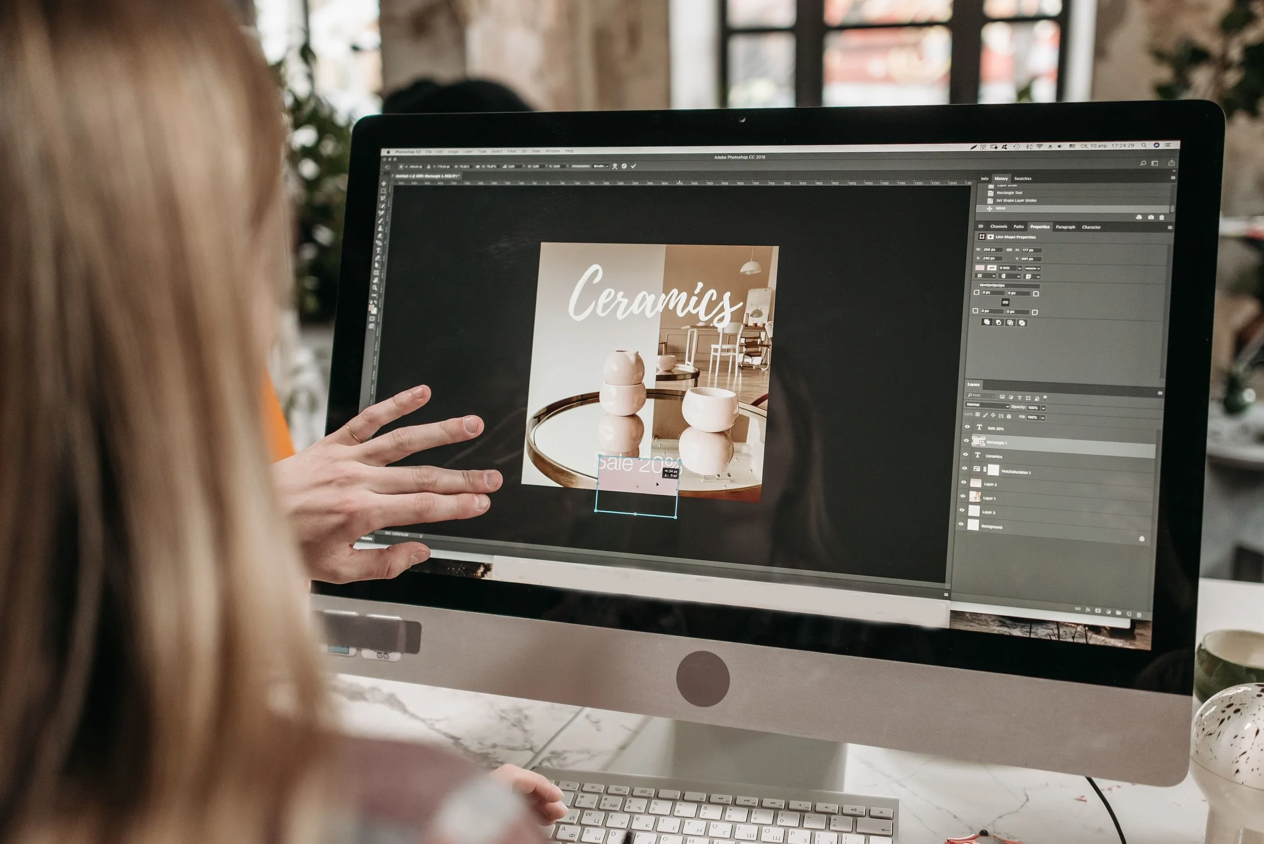
Start with your hero image. It's the first thing people see, and it does a lot of heavy lifting. If it's a generic stock photo, a low-resolution image, or something that simply doesn't reflect your business today, replace it. Clear, bright, natural-looking photography almost always outperforms the alternative.
Then look at your colour use. Inconsistency—buttons in three different shades, headings that don't match, accents that clash—signals a lack of care, even if everything else is solid. Pick two main brand colours plus a neutral and apply them consistently across buttons, headings, and visual accents.
Test It Safely
If you're on Squarespace, duplicate a page before you touch it. Try different font pairings and image placements on the copy, and roll the changes out across the site only when it feels right. There's no reason to experiment on a live page.
The goal here isn't to chase what's trending. It's to make sure your website looks as current, confident, and cohesive as the business it represents.
Navigation
3. Make Your Navigation Effortless
A modern website feels easy to move through. Visitors shouldn't have to think about where to click next—and they shouldn't have to hunt for basic information like your services, your pricing, or how to get in touch.
Most navigation problems come down to two things: too many menu items, and labels that try to be clever instead of clear.
Keep your main menu to five or six items at most. A common structure that works: Home, About, Services, Portfolio or Work, Blog, Contact. Simple. Predictable. Effective.
Use plain labels. "Services" works better than a branded name that means nothing to someone who just landed on your site. "Contact" works better than "Let's Chat"—especially for professional service buyers who want to move efficiently.
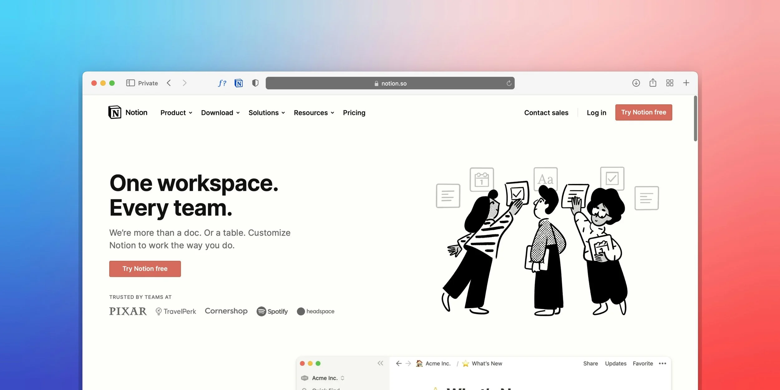
Here's a quick test. Open your website and pretend you're a first-time visitor. Give yourself ten seconds to answer three questions:
What does this business do?
Who do they work with?
How do I contact them?
If you can't get to those answers quickly, your visitors can't either. Fixing your navigation is one of the highest-leverage changes you can make—it costs nothing and affects every page on your site.
Mobile
4. Check Everything on a Phone
The majority of web traffic happens on mobile. If your site is difficult to use on a small screen, a large portion of your potential clients are having a poor first experience—and most of them won't come back to check on a desktop.
Even if you're on a platform like Squarespace that handles responsiveness automatically, it's worth checking the mobile experience yourself. Platforms optimize for the general case. Your specific content and layout may still have issues.
Scroll through every page on your phone. Look for:
Text that's too small to read comfortably
Buttons that are too close together to tap accurately
Sections that feel cramped or cluttered
Important information that gets buried far down the page
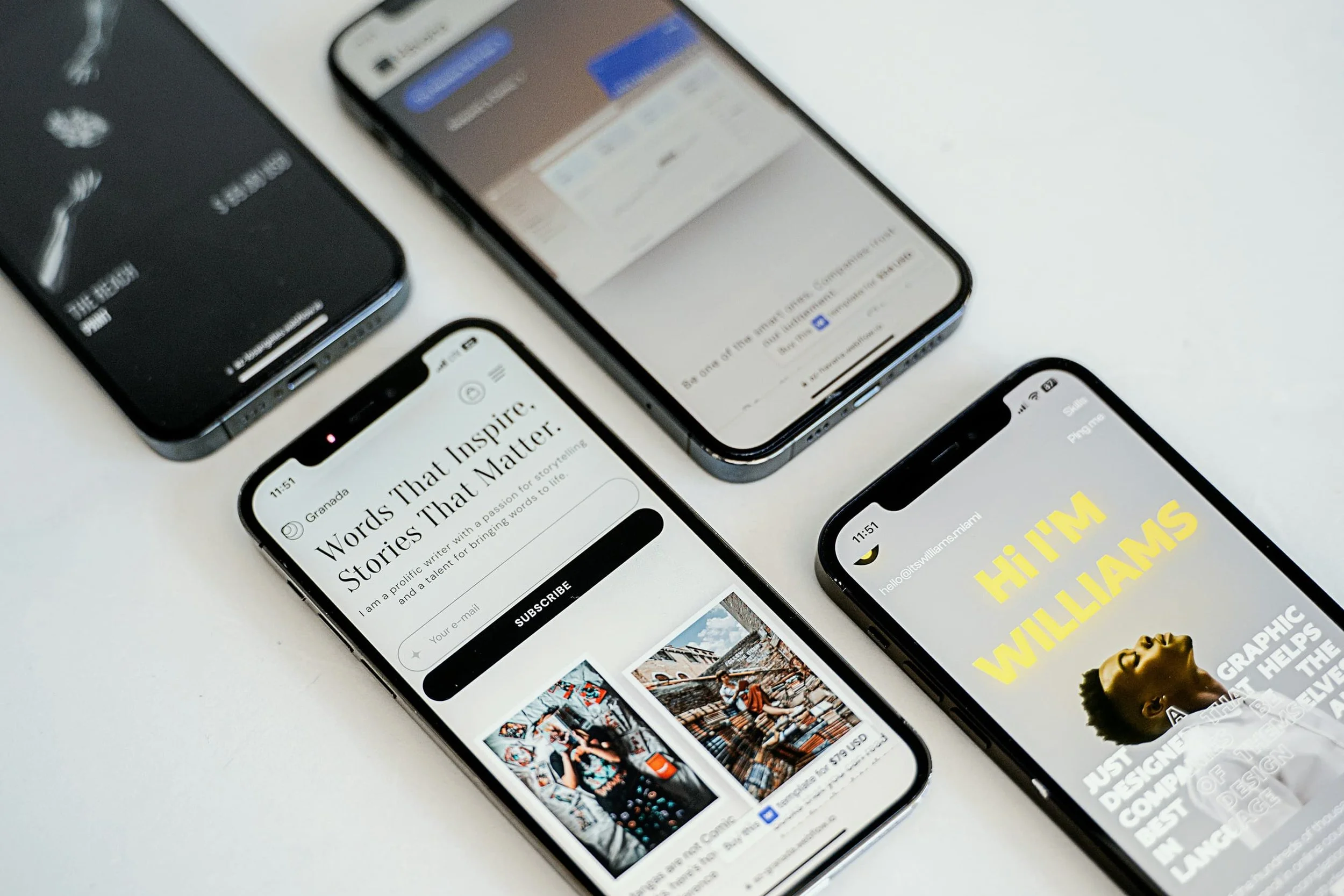
If something feels heavy on mobile, there are simple fixes:
Break dense sections into shorter chunks
Reduce the number of images stacked in a single row
Adjust spacing so the page breathes a bit more
One check worth adding: try to book yourself. Go through your own contact form or booking flow on your phone, thumb only, the way a client would—standing up, on the go, or half-distracted. That's the real test, and it's the one most people never run on their own site.
You don't need to optimize for every screen size. Getting the phone experience right puts you ahead of most small business websites already.
Voice
5. Let Your Personality Come Through
A lot of service businesses offer similar things. What makes the difference—especially for buyers who are ready to invest in quality—is the sense of who they'd be working with.
A generic website reads like a generic business. And a generic business rarely commands premium rates.
The fix isn't to overhaul your brand or add a dramatic origin story. It's to add a few honest, specific details that let your perspective come through.
On your About page, consider adding:
A short, genuine explanation of why you started this business—not a polished version, just the real one
A description of what your clients are usually dealing with before they find you—it shows you understand them
A brief walkthrough of what working with you actually looks like, step by step
These don't need to be long. Two or three well-written paragraphs can make your website feel human, specific, and memorable—where before it felt like it could have been anyone's.
That specificity is what helps you stand out. Not louder headlines or more features. Just evidence that there's a real, capable person on the other side of this website.
Proof
6. Put Social Proof Where It Does the Most Work
You don't need dozens of reviews or a formal case study library to build credibility. A handful of specific, honest testimonials—placed strategically—can shift how a visitor feels about working with you.
The key word is specific.
✕ Moves No One
"She was great to work with!"
✓ Does Real Work
"Before we worked together, I was embarrassed to send people to my website. Now I use it as a sales tool."
If you don't have testimonials like that yet, reach out to two or three clients who were genuinely happy with your work. Ask them:
What was going on before we worked together?
What changed after?
What would you tell someone considering hiring me?

You can edit lightly for clarity, with their permission, and then place them where they'll have the most impact:
One near your services section, where visitors are evaluating you
One near your contact or booking section, where they're about to make a decision
A strong quote on your homepage, where it can anchor the page
If you have project photos or before/after visuals, pair them with a short explanation of the work and the outcome. It doesn't need to be formatted as a formal case study. A brief story—what the client needed, what you did, what changed—is more than enough.
Over time, these trust signals accumulate. Your website starts to feel like a record of real results, not a list of claims.
Maintenance
7. Keep It Current—With Small, Regular Check-Ins
A website doesn't stay modern on its own. But keeping it current doesn't have to be a major project. It just has to be consistent.
Set a monthly reminder to do a quick audit. It takes fifteen minutes and makes a meaningful difference over time. Use it to:
Click through every page and check for broken links
Remove outdated offers, expired promotions, or services you no longer provide
Swap out any low-quality or obviously generic stock images when you have better options
Add something fresh—a recent client result, a new testimonial, a short post about a project
These small maintenance tasks do two things. They keep your website accurate and trustworthy for visitors. And they send a consistent signal to search engines that your site is active and well-maintained—which matters for visibility.
Visitors notice a site that feels looked after. It's subtle, but it's real.
A Realistic Plan
A Realistic Plan: One Focus Per Month
You don't need to tackle all seven of these in a single weekend. In fact, trying to do everything at once is one of the most common reasons website updates never actually happen. Here's a simple approach:
Month 1—Rewrite your homepage copy
Month 2—Update your hero image and visual consistency
Month 3—Clean up your navigation
Month 4—Review the full mobile experience
Month 5—Add or reposition testimonials
Month 6—Refresh your About page
Each update makes your website feel a little more like the business you're running now, and a little less like the one you were running when you first built it.
That gap—between where your business actually is and where your website suggests you are—is what these changes close.
The Honest Limit
When These Fixes Aren't Enough
Seven fixes will carry a site a long way. They won't carry every site. Sometimes the problem isn't the copy or the hero image — it's the structure underneath them. Incremental updates stop paying off when:
The site was built for a business you no longer run. If your services, your pricing, and your ideal client have all shifted, you aren't modernizing a website—you're renovating around a floor plan that no longer fits.
Every change fights the template. If a simple layout adjustment takes an afternoon and still looks wrong, the build is the constraint—not your effort.
You've done the work and it still underperforms. Sharper copy on a site with no clear path to contact you is just a better-written dead end.

The honest read: most sites need the seven fixes, not a rebuild. Some need both. A small number genuinely need to start over. The point of an audit is to tell you which one you're actually looking at — before you spend six months on the wrong one.
Putting It Together
The Bottom Line
A modern website isn't about chasing trends or doing a full rebuild every two years. It's about keeping your online presence accurate, clear, and easy to trust.
Most of the updates above cost nothing but time. And most of them have an outsized effect on how visitors experience your business—and whether they reach out.
If you've worked through some of these updates and feel ready for something more comprehensive, there are two ways to work with us:
✦
Custom Squarespace Website
For businesses whose brand is in good shape, but whose website isn't doing it justice.
✦
Strategic Branding + Website
For businesses ready to bring their visuals, messaging, and online presence into full alignment.
Not sure which fits? Start with the audit below.
— ◆ —
Work With Personal Web Pros
Find Out What's Actually Worth Fixing First
Start with a free website audit. We'll look at what's working, what isn't, and what's worth addressing first—no strings attached.
Start With a Free Audit →Personal Web Pros builds Squarespace websites and brand systems for consultants, coaches, and expert service providers. Your expertise is world-class — your website should be too.