

A private chef's website where local ingredients take centre stage
CONCEPT · CUSTOM BUILD

We designed a brand and website for a fictional private chef who brings a seasonal tasting menu to your home, built from the farms nearby.
A concept project: a fictional business, designed and built in full to show our custom work.
INDUSTRY
Private chef
PROJECT
Concept build: Chef Edward Davies (fictional)
SCOPE
Brand identity, website design, copy
PLATFORM
Squarespace 7.1
CUSTOM CODE
None needed
HOW IT STARTED
The brief
Edward is a fictional chef we created to show what a custom brand and website project looks like. His idea: a restaurant-calibre tasting menu, cooked in your kitchen, built from everyday ingredients grown nearby.
Most private-chef websites look the same: candlelit, hushed and vague about what's actually on the plate. Edward's needed to make the ingredients the star, show off the technique and make booking an evening feel easy.
The Challenge:
Edward's name passed from one dinner-party host to the next, season after season — but the website hadn't kept up. It was a single placeholder page: a headshot and an email address, no menus, no sense of the evening, no way to see a past event or make a proper enquiry. For the kind of host who books a private chef, it read as casual and unfinished.
The food was worth a premium; the website priced it like an afterthought and asked serious hosts to book without proof.
- A single placeholder page — a headshot and an email address, and little else
- No menus and no sense of the evening, so hosts couldn't tell if he was the right fit
- No gallery of past events doing the persuading
- No proper enquiry path — just an email address to write to cold
- For a genuinely premium service, a site that read casual and unfinished
What we built
A complete brand and a six-page website, built entirely with Squarespace's own tools.
A market-table brand
Beet, radish, pistachio and cream, with a chunky, friendly serif for the menus. Bright and generous instead of dark and formal.
Ingredient to course
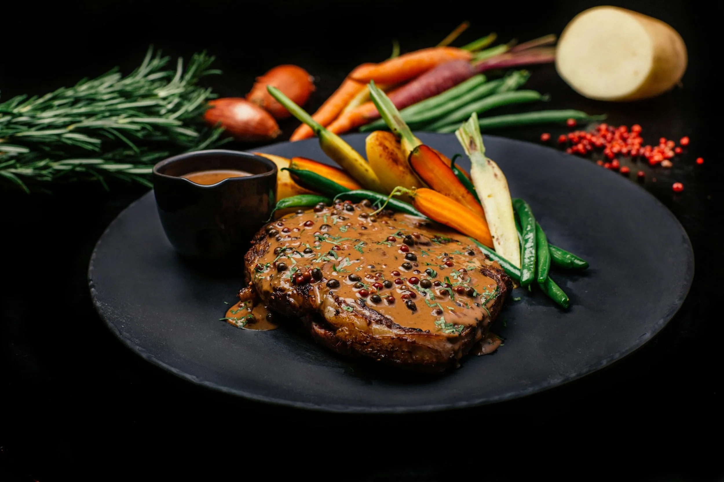
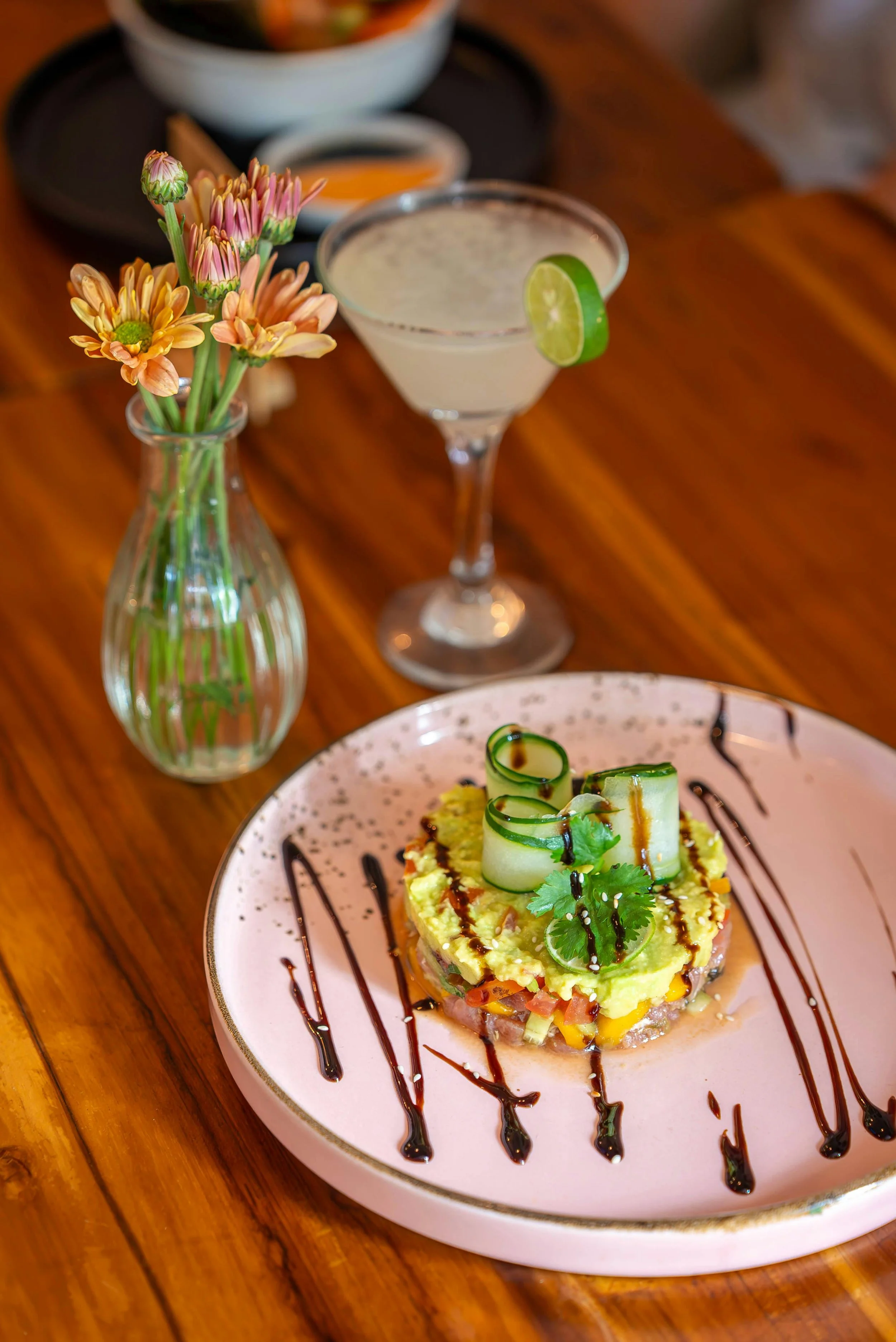
Each course shows the finished plate with the raw ingredient in a round medallion beside it, plus where it was grown and how it was cooked.
A local larder
A page for the farms and producers behind the menu, so the sourcing is part of the story, not a footnote.
Booking made simple
A clear explanation of how an evening works, and an enquiry form that asks the right questions up front: date, guests, dietary needs.
The work
Home, desktop + mobile:
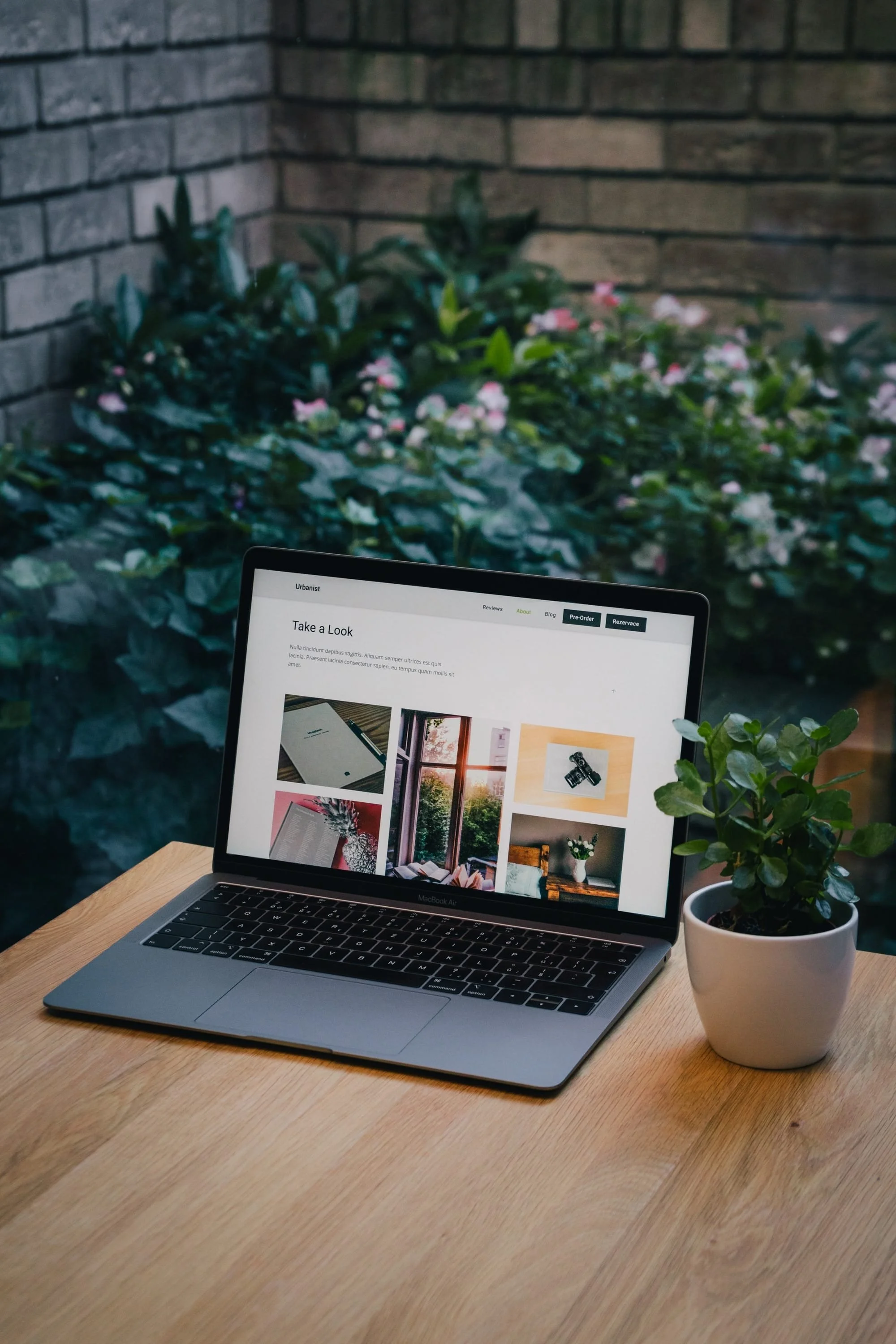
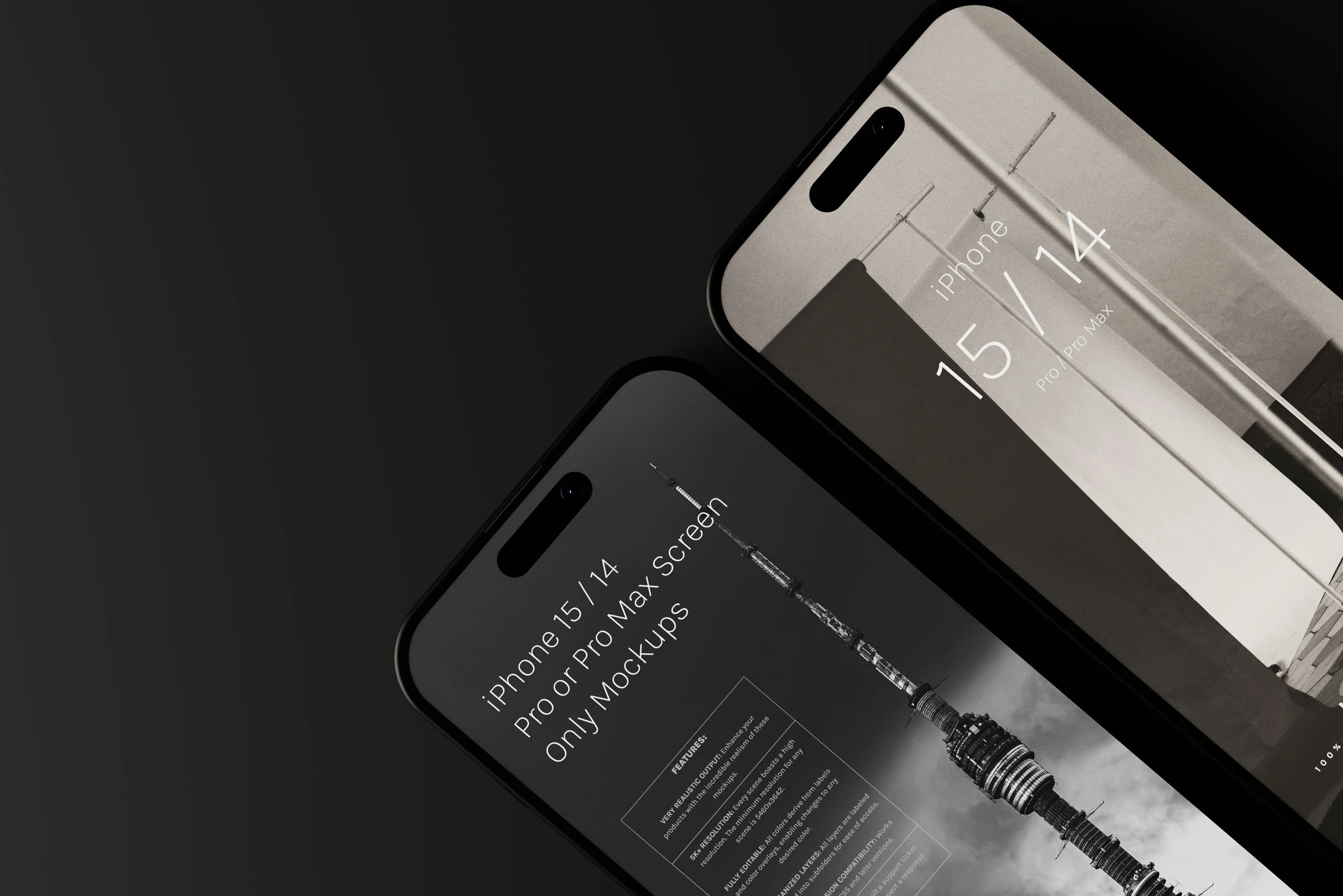
DESKTOP · HOME / MOBILE · HOMEThis season's menu (ingredient-to-course cards) + the tasting menu card:

INGREDIENT TO COURSE / TASTING MENUThe local larder + Book your evening:
LOCAL LARDER / BOOKING FORM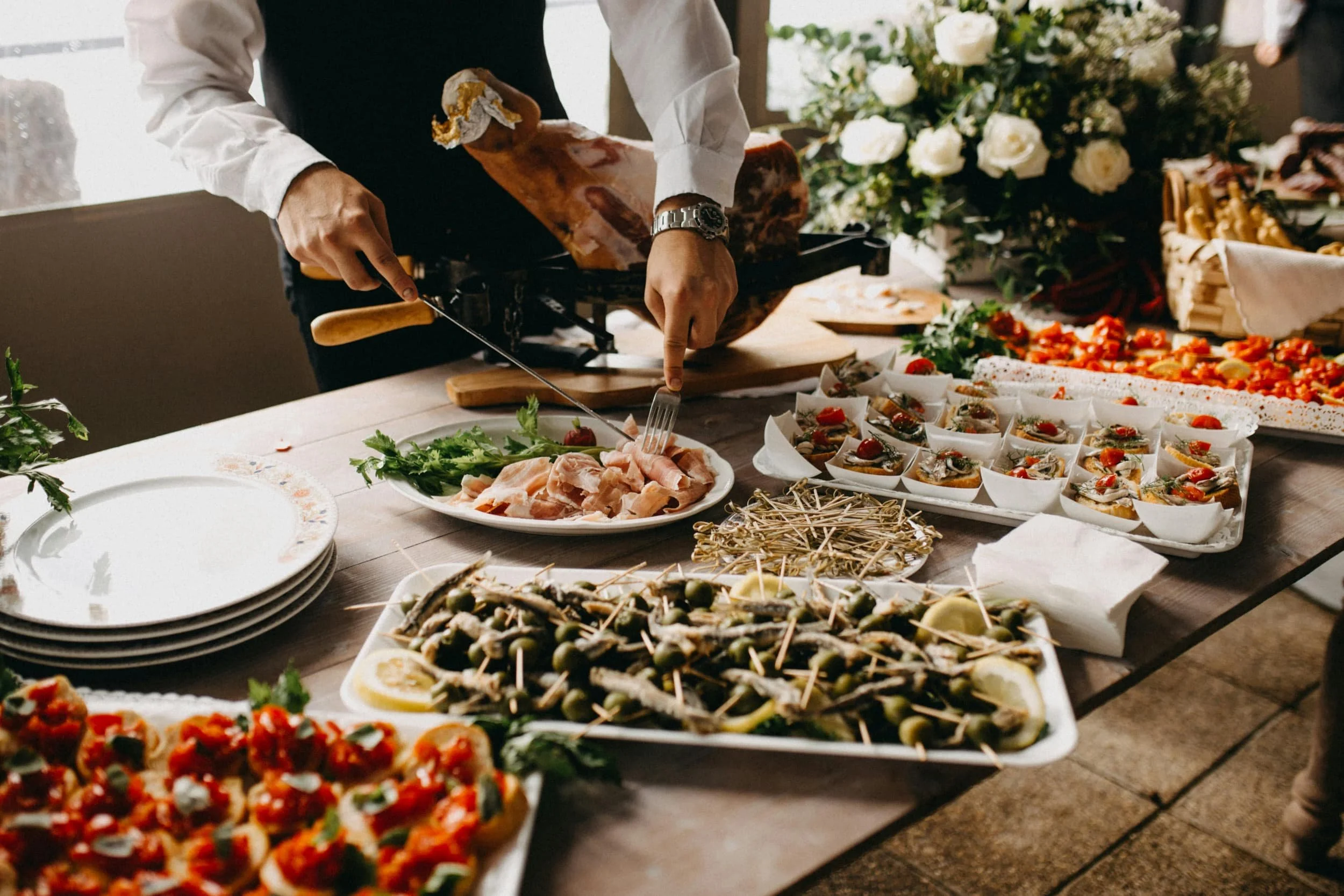
What we changed
- Experience-led homepage — the feel of the evening first, the credentials second.
- Signature menus — three defined experiences so hosts self-select before they enquire.
- Proof of the work — a gallery of past events and plated courses doing the persuading.
- One enquiry path — a short, guided form that captures date, headcount, and dietary needs up front.
We built the site around the experience of the evening, not just the menu. Every page moves a curious host closer to one clear action — sending a well-informed enquiry — so the first conversation starts from interest, not from scratch.
The Build
Before — a single placeholder page with a headshot and an email address; no menus, no gallery, no enquiry flow.
After — an experience-led homepage, a signature-menus page, a plated-event gallery, an authority-building about page, and a guided enquiry form.
RESULTS
What this build shows
A food business's website can show its point of view before a guest takes a single bite. Pairing each dish with the ingredient behind it explains the idea instantly, and gives a chef's sourcing the spotlight it deserves.
It also shows that a menu that changes with the seasons doesn't need a developer. Every course card, medallion and larder tile is a native Squarespace block, so swapping in next season's ingredients takes minutes.
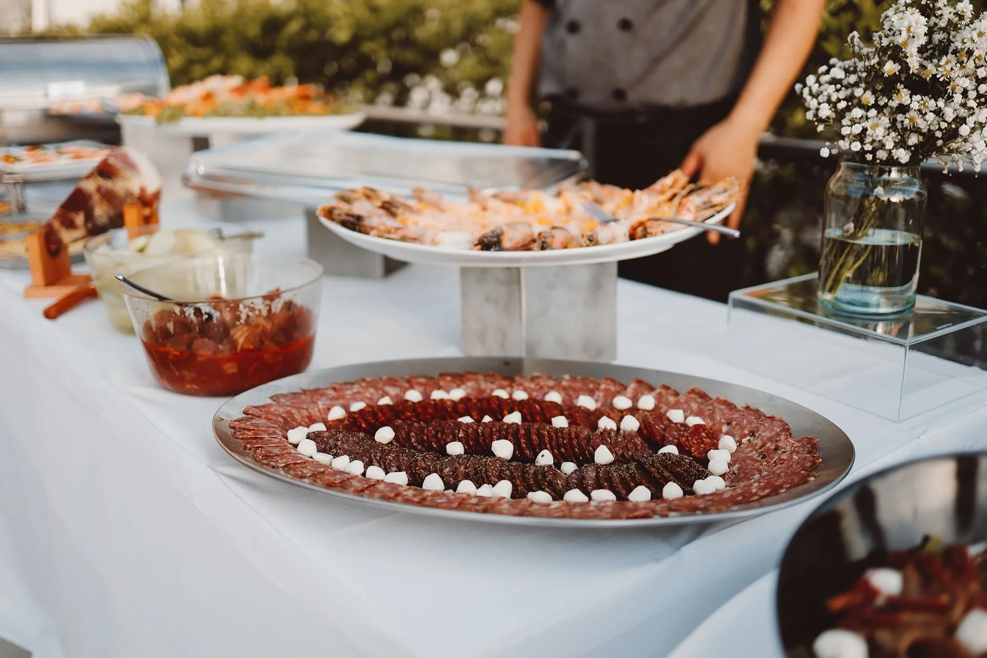
The outcome
A site that feels as considered as the dining itself. Hosts now arrive already knowing the kind of evening they're booking, so the first conversation starts much closer to yes — and the enquiries that come through are a better fit.
*Illustrative sample outcomes for a mock project.
IN THEIR WORDS
“Booking used to start from scratch every time. Now people arrive already knowing the kind of evening they want — we start much closer to yes.
My food was never the problem; the old site just didn’t do it justice. Now the enquiries come from exactly the kind of hosts I love cooking for.”

START A PROJECT
Your business is one of a kind. Your website should be too.
Tell us about your business, and we'll recommend the route that fits your goals, timeline and budget.